
Of Ice Creams and Introspections…
Recently, Baskin Robbins changed its logo.

Quite a departure from its earlier logo, which with its bright pink and blue colours and sacrosanct number 31 (to stand for 31 flavours, one flavour for each day of the month) conveyed a cheerful, bright image.
This is what the creative agency that worked on the change had to say about the new logo:
“The new visual identity system would turn fans of yesterday into brand loyalists of today and capture Gen Z’s heart with everyday moments of “happy”. This rebranded identity was rolled out in conjunction with a new marketing campaign. The central idea of the new campaign? – “Seize the yay.”
Regardless of our opinion about the new Baskin Robbins logo and their new campaign, this news did get us thinking about rebranding in general.
In this edition of FreeFlowing, we will talk about this interesting and intriguing topic, and share some rebranding examples with you.
Rebranding- a quick primer
First off, let’s understand what “Rebranding” is.
A Google search throws up an interesting definition: “Rebranding is a marketing initiative in which a brand’s identity (i.e., its “look and feel”) is changed, typically for the purposes of influencing how a brand is perceived in the minds of its consumers and stakeholders.”
The words “look” and “feel” in this formal definition tell us two interesting facts about rebranding.
First, rebranding is about changing a brand’s ‘look’, so logo change is integral to it.
In fact, a logo change is the most visible part of a rebranding exercise as it is often announced with a new marketing campaign and/or a new brand ambassador. And in some cases, it might even involve a name change- an aspect we will cover later in this article.
Second, rebranding should influence consumer perceptions about a brand.
Obviously, it is naïve to assume that a mere logo change supported by a creative spiel is going to change how consumers ‘feel’ about a brand. This implies that rebranding cannot run just skin-deep. Consumers should be able to see a clear and positive “Before” and “After” not just in the brand logo but also in other parts of the mix- ranging from website/app design, marketing collateral & communication to product packaging, offerings and service standards, resulting in brand revitalization.
Net, logo change in rebranding is meant to convey a singular core message to consumers and external stakeholders – “we are changing the way we do business, and this is the first external signal of that change.”
A rebranding exercise that stops at a mere logo change is ineffective because for consumers, a brand is a collective sum of experiences, and unless those experiences change for the better, consumers are likely to be at best neutral or at worst, hostile to rebranding efforts.
What prompts businesses to undertake a rebranding exercise?
Rebranding is an expensive exercise, from the point of view of monetary outlay (both in conception and execution) as well as the cost of changing memory structures that consumers form about a brand over time.
Therefore, rebranding is not an exercise that brands should jump into without due consideration. While there is no hard and fast rule regarding when brands should embark on this journey, the underlying reasons often vary from strategic to tactical, from external triggers to internal pressures.
From our observations and experience, we have laid down several rebranding examples here; both the good reasons and the red flag ones.
When is a rebranding exercise justified?
Outgrowing the early growth phase: Typically, startups do not prefer to spend a lot of money on design exercises during the launch phase when they are fully focused on achieving product-market fit (PMF).
During this time, any logo and brand identity design work is often done with a fit for purpose mindset than a strategic one. But once the brand achieves PMF, it may become necessary to re-look at the identity, including the logo. Having said that, brands embarking on this journey need to ensure that rebranding syncs with their strategic business initiatives. It shouldn’t remain just a cosmetic change.
E.g. Lenskart underwent a complete rebranding exercise in 2015 to upgrade its design from its early launch phase days.

Coming 5 years after the brand’s launch, the new logo captured the core premise of Lenskart – which centered on “the idea of converting eye-wear from a serious medical prescription driven product to a playground of looks”.
The rebranding extended beyond the logo to product packaging, prescription cards and product display on the website. This also coincided with the offline foray of Lenskart and defined the look and feel of its stores.
To sync with the evolving consumer and the category: especially applicable to new-age tech brands, who may find that their category and consumer contexts are fast changing. Taking notice of this change and benefitting from it requires the business to make some important strategic tweaks- and rebranding is a confident signal that the brand is well-poised to capitalize on the changing market dynamics.
E.g. In 2015, Flipkart undertook a rebranding exercise in response to the rapidly evolving mobile-first consumer behaviour and the resurgence of the app economy. The brand intent was to show a more youthful, innovative, fast service that was app first. The new brand identity “represents Flipkart’s vision of commerce in India by reinstating its focus on the mobile platform,” said a release by the company.

This is what Mukesh Bansal, the then head of commerce at Flipkart, had to say about the logo change: “Flipkart has evolved into a pretty much mobile-centric platform. This will be our identity across all touchpoints, whether it is desktop, mobile, online, offline, print, everywhere”.
The logo change was accompanied by an increased thrust on mobile platform- with a renewed focus on the Flipkart Shopping App. As a marker of its intent, the rebranding exercise also coincided with the launch of Flipkart’s “Seller App” that for the first time enabled its sellers to seamlessly manage their Flipkart business on an app.
In Flipkart’s case, the rebranding exercise was thus also an act of complete brand revitalization.
To neatly tie in brand offerings in a coherent and cohesive manner: in some cases, a rebranding exercise is necessitated because the brand is expanding – in terms of geography, the scope of services or product lines. Accommodating new and often disparate businesses without creating consumer confusion calls for consistent brand architecture. Rebranding helps to deliver this.
E.g. Urban Clap rebranded to Urban Company because they wanted to become a global horizontal platform – offering multiple services in addition to their initial offering of home repair solutions.

The rebranding exercise helped Urban Company develop an identity that could seamlessly accommodate its 6 business verticals as sub-brands (Urban Beauty, Urban Grooming, Urban Spa, Urban Cleaning, Urban Repairs and Urban Painting). This brand architecture brought in a sharper business focus.
As Abhiraj Bhal, co-founder and CEO of Urban Company said in an interview with Mint, “We now have a bouquet of services, so it was important to have a mother brand or an umbrella brand which can house all these sub-brands. Urban Company will be our brand forever for all markets and geographies now.”
When the brand’s mission is not clearly captured by the current identity– Brands may also realize that their existing brand identity does not correctly capture the true essence of their purpose. In such cases, it is better to invest in rebranding so that the brand identity can encapsulate the brand’s purpose. For successful rebranding, a brand needs to ensure that its purpose doesn’t just remain a logo or a tagline and instead gets reflected in execution at every consumer touchpoint.
E.g. When after comprehensive reflection, Airbnb founders realized that their brand purpose needed to transition from ‘helping travellers rent a home to stay,’ to ‘help travellers belong anywhere’, they felt that the brand needed to make some fundamental changes to truly live its purpose.
This necessitated a complete rebranding exercise that could help Airbnb embrace and announce its commitment to the mission:
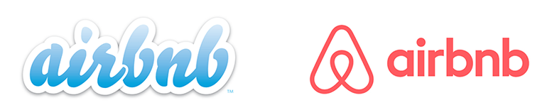
As per the Airbnb founding team: “The new logo of Airbnb, named “Belo”, is a symbol of belonging. The symbol itself is a combination of four simple symbols: a head to represent people, a location icon to represent place, a heart for love and then an A for Airbnb.”
Brian Chesky, the CEO of AirBnB, had this to say about the reason behind the rebranding exercise:
“For so long, people thought Airbnb was about renting houses. But really, we’re about home. You see, a house is just a space, but a home is where you belong. And what makes this global community so special is that for the very first time, you can belong anywhere. Belonging is the idea that defines Airbnb, but the way we’ve represented Airbnb to the world until now hasn’t fully captured this. ”
In sync with the new purpose, the brand also made several changes in its product- ranging from the look and feel of its mobile app to offering authentic local experiences that could help travellers immerse in the local culture.
To signal that the brand is changing with the times – this is usually done by legacy brands, to refresh and contemporize their image. This rebranding exercise often coincides with brands’ foray into new business verticals or geographies and needs to strike a fine balance as the brand would ideally like to retain the legacy trust while incorporating new-age values.
Radical transformations that completely let go of the past might come across as schizophrenic or desperate and are common execution pitfalls to avoid here.
E.g. Godrej, the 125-year-old conglomerate whose offerings range from security equipment to soaps, went for a rebranding exercise in 2008. The core objective behind this initiative was to project Godrej as a progressive brand that’s contemporary and creative.

With the new identity, the brand sought to shed its industrial legacy without losing the essential consumer trust it has come to command over its long history. In addition to a logo change, the brand also embraced a new business strategy that identified 4 “Hero Businesses” in the conglomerate: Personal Grooming, Properties, Furniture and Appliances- and gave them a unified identity.
To signal a brand’s commitment to future–shaping bold bets – in rare cases, brands/founding teams might realize that their future growth is not just in a new product area or category, but in a new and emerging technology whose contours are not yet clearly defined. Brands in such cases take it upon themselves to explore the possibilities and unlock the potential in the area. Such a bold pivot calls for a rebranding exercise that rallies both the business and the organization in the direction of the new vision.
Of course, only a handful of companies are in a legitimate position to take such bold calls.
E.g. Facebook rebranded to a parent company Meta, with a bold bet on Metaverse that Mark Zuckerberg sees as the “future of the internet”.

In the words of Mark Zuckerberg, “Over time, I hope that we are seen as a Metaverse company, and I want to anchor our work and our identity on what we’re building towards”.
And this announcement has had a cascading impact at a global level. Metaverse technology and conversations around its applications have become a part of mainstream conversations around the globe.
To be fair, the rebranding exercise in this case was also necessitated due to Facebook becoming a Social Media conglomerate through the acquisition of Instagram and WhatsApp.
As Mark Zuckerberg himself put it: “I think that there was just a lot of confusion and awkwardness about having the company brand be also the brand of one of the social media apps…. it’s helpful for people to have a relationship with a company that is different from the relationship with any specific one of the products; that can kind of supersede all of that.”
Meta thus serves the dual purpose of not just conveying the larger vision of company but also tying up all businesses neatly under a well-defined corporate identity while ensuring that isolated issues with individual platforms (e.g. controversies around Facebook) don’t cast a negative shadow on the overall corporate image.
Red flag reasons for rebranding
Sometimes, brands go in for rebranding for wrong reasons. If any of these ‘red flag’ reasons seem to drive the rebranding project, the marketing team probably needs to pause and reflect.
When the brand is losing relevance: sometimes, rebranding is seen as a way to refresh and rejuvenate a brand which is losing market share or whose revenues are declining. It’s a move born out of desperation. Rather than investing precious organizational time and money in rebranding, it’s wiser to understand the root cause of the brand’s stagnation / decline and work on it. Rebranding exercises in such cases may not be enough to significantly move the business needle.
E.g. Snapdeal committed to a Rs 200 Cr rebranding exercise in 2016 (Unbox Zindagi), which was an attempt at revamping a brand that was facing stiff competitive heat from the likes of Amazon, Flipkart and Myntra. With a lopsided focus on cosmetic changes (with a high decibel above-the-line campaign involving a mega-celebrity Aamir Khan) without much change in intrinsic strategy (catalogue width, tech experience, support etc.), the rebranding on its own didn’t seem to achieve much for the brand.

Stature signalling – sometimes a rebrand is done simply to signal that a brand “has arrived.” This often happens immediately after a funding round when the brand is flush with cash. More so if the brand is a newbie competing in a category with strong contenders.
Costly collaboration with reputed global/national agencies, heavy media hype and mega-communication budgets give a short-term spike to a brand’s awareness and salience.
While stature signalling might make the internal team happy, for a brand it achieves little more than building a high top-of-mind recall. And unless the brand complements its high awareness with a superior product, better choice or consumer experience, the overnight stardom accomplished through this route may not be sustainable.
E.g. In a category with established players like 99 Acres, Magic Bricks and Common Floor, Housing.com’s “Lookup” rebranding happened exactly 3 months after their largest round of funding of $100M. Costing the company an estimated INR 50-80 Cr for just one phase of execution, the long-term impact of this rebranding exercise is anybody’s guess.

Internal monotony – Sometimes, rather than due to consumer or business needs, the rebranding project is conceptualized due to internal monotony.
Sometimes the brand team starts to find its logo or colours monotonous.
Or else a new player enters the market and the field team feels that their brand needs a ‘facelift’ to stand out.
Worse yet, there is a new team at the helm that wants to leave its own ‘mark’ on the brand.
In such cases, rather than meeting any consumer-relevant need, the rebranding project becomes a means to fulfil personal agenda or satisfy internal stakeholders. This is often a recipe for disaster because here the rebranding is done just to please the internal team and not the consumers.
Finally, rebranding may not always be a willful choice…
It is also important to note that rebranding may not always be led by a consumer or business rationale. There are instances when rebranding becomes an imperative given the constraints before the business. In such cases, rebranding is a workaround for managing these constraints. In most other aspects, it’s ‘business as usual’ for the brand with little or no change experienced by the consumer.
3 common instances are:
a. Legal and regulatory constraints: when a brand is required to change its logo for legal reasons E.g. World Wrestling Federation was forced to change its identity to World Wrestling Entertainment due to legal threats from World Wildlife Fund, whose name it clashed with.
b. Mergers and Separations: when a brand logo is changed due to mergers or separations, creating the need for a new visual identity. E.g. Vodafone and Idea merged to create a new brand identity of Vi and Hero Honda became just Hero after Honda left.
c. Countering negative perceptions: sometimes the brand logo or visual identity itself becomes a reason for backlash by a vocal set of consumers. In such cases, at times brands deliberately incorporate cosmetic changes that manage broader public perceptions, with little to no change in other aspects of the business.
A good example of this is Fair & Lovely changing its name to Glow & Lovely in an effort to manage pushback from a vocal set of new-age consumers. From the startup world, Myntra changed its logo, goaded by objections from some vocal sections of social media who found its old logo to be offensive towards women.

To sum up
There may be several legitimate and red flag reasons for rebranding. However, as we mentioned before, rebranding is a costly and time-consuming exercise, not to be undertaken lightly.
Brands work hard over a long time to build memory structures in their consumers’ mind. When a brand changes its identity, this memory structure is disturbed and needs to be rebuilt. That can be a painful process, and the brand may lose its hard-earned equity in the bargain.
This is more important today than ever, given the falling attention span of consumers and their search for shorthand to ease decision-making.
This is why established brands that stand the test of time are very thoughtful about embarking on this journey. And even when they do, they change things incrementally and subtly, handholding consumers through the transition so that they do not feel alienated at any point. Some of the most recognized and loved brands across the world like Apple, Mercedes, Nike, Coca cola etc. are great examples of this.
Circling back…
Now that we have discussed the good and not-so-good reasons for rebranding, what do you think about Baskin Robbins rebranding? Have you been personally involved in any such project and have an experience to share? Let’s keep the discussion flowing at freeflowing@winnerbrands.in. We read all your emails.